Studio Logos by Association
A recent Variety article investigated the changing nature of studio logos in the context of their growing running times. The author, Peter Debruge, suggests that not only are studio logos increasingly reliant on splashy animated sequences which can run half-a-minute in length, modern feature films can also suffer from pre-credit logo overload. With the proliferation of co-financing deals between production companies, the majors aren’t the only ones anymore with logo flair. As Debruge highlights, “Everyone from Tom Hanks to Mel Gibson to Ben Stiller has a company these days, and they all want placement.” I would argue that one of the key reasons behind such cramped pre-credit sequences is the decline of main credit sequences (discussed here). It seems likely that production companies want recognition up front before the end credit surge.
While there do not seem to be any rules governing the placement or length of production logos, Debruge does suggest that major distributors prefer to go first, and no one likes to be outdone by longer sequences, which is why most cap at sixteen seconds. A quick visit to YouTube seems to confirm this point. However, the article raised a few more questions in my mind about the nature of studio logos. While Debruge discusses the visual panache of some logo designs, he does not mention one key effect of the studio logo sequence: its associative effects.
Thinking about studio logos, I remember their iconic resonance on my childhood. As a budding cinephile I took note of studio logo designs in different eras of Hollywood history. As a teenager I wondered if there was such a thing as “house style” in contemporary movies as there seemed to be in the classical era. Some authors have pointed to a distinct house style in the 1930s (see Thomas Schatz and Paul Grainge), when MGM’s Leo the Lion symbolized the opulence and grandeur of musicals (The Brodway Melody of 1938) and epics (Mutiny on the Bounty); Warner Bros. distributed “gritty,” social dramas and gangster films; Universal produced low-budget horror films (Dracula); and Paramount’s distinctly “European” flavor, employing emigree directors such as Josef von Sternberg and Ernst Lubitsch.
It might be harder to observe definable house styles today as the modern studio is little more than a distribution channel for smaller production companies. There are certainly trends in studio output, in that audiences can discern the type of film from a particular distributor. In recent years, the art-house crowd would be remiss not to trust the Miramax brand for its attention to European and Asian filmmakers and imports, intimate dramas, and award season prestige pictures. In the 1980s and 1990s New Line Cinema established a unique brand by releasing Wes Craven’s Nightmare on Elm Street series alongside John Waters’ Serial Mom and other horror and fantasy films. Perhaps now New Line is most often associated with Peter Jackson’s Lord of the Rings trilogy.
However, the majors have avoided this type of catalogue branding, if only because they risk missing on specific markets by remaining loyal to particular genres or styles. In many ways, the contemporary major studio — like in the past — specializes in a range of genres, franchises, and styles. We should remember that Warners is not only home to Harry Potter, Superman, and Batman, but has remained a home to Clint Eastwood and was also the permanent home of Stanley Kubrick.
Instead of looking for particular groupings or inherent “house styles” among the modern majors, I offer an alternative criterion by which to assess the impact of studio style by way of the logo sequence. In less than twenty seconds the logo sequence must convey a message in image and sound that defines an identity to the audience. If a studio was not interested in conveying a brand identity, then why advertise itself so verbosely before every film?
I am suggesting that these unique logo sequences offer associational frameworks by which audiences identify studio output. These associations are by no means homogeneous, since we all have different cinematic experiences. But it is likely that we have associations with studio sequences that have shaped our understanding of specific genres, filmmakers, and (most obviously) studio style.
For me, the associational nature of pre-credit sequences can have a Pavlovian effect. Let me explain. I’m flipping channels one afternoon and I happen upon the “zooming globe” Universal Pictures logo. Based on the animated design, I am immediately attuned to the era of the logo (the 1970s and early 1980s); I listen for any musical clues that might identify the forthcoming film. The presentational value of the logo extends to my own personal history with the logo and the films associated with it. Thus, I identify the Universal globe with a particular era of studio filmmaking, one with which I have always been fascinated.
The associational value of the pre-credit sequence is very much rooted in my adolescence, when I discovered new things about cinema every day. To put it not so romantically, I watched a lot of movies and over time some of them actually stuck with me. What also stuck with me were those iconic emblems of Hollywood studios. And, more often than not, the emblems symbolized not studio style but a particular film experience.
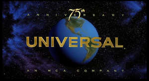
I have already mentioned the Universal zooming globe, which gave way in 1990 to a more three-dimensional animated sequence that paid tribute to all previous Universal pre-credit sequences. You can see it here. This sequence, which signaled the studio’s 75th anniversary, was supported with music by James Horner and premiered with Back to the Future III and later reverted to a shorter intro minus the montage. This serene sequence was replaced in 1997 (attached to Jurassic Park: The Lost World) with the current “shimmering” Universal globe, which carries a Jerry Goldsmith fanfare.
Watching the 1990 incarnation of the logo, I am instantly reminded of my trip to the theater to see Back to the Future III. The 1970s logo carries memories of the original Back to the Future, Jaws, and American Graffiti. You could make the argument that the films I have mentioned belong to a certain filmmaking or stylistic category, which could constitute a certain house style. In the 80s it was not uncommon to refer to Universal at the studio that Steven Spielberg revitalized. Indeed, the studio’s top grossing films of the late 70s and early 80s are Spielberg productions: Jaws, E.T., and the Back to the Future series (which he co-produced). However, this does not explain MacArthur, Animal House, the surge of John Hughes comedies in the 1980s, Field of Dreams, and Born on the Fourth of July to name just a few deviations from the Spielberg “style”.
In much the same way, I associate the DreamWorks sequence with Steven Spielberg, even though not every DreamWorks film is connected with the bearded one. But there are several subtle textures that point to a Spielberg style: the use of music by longtime composer John Williams, the moon and child imagery, and the little fact that he co-founded the studio. As a side-note, I never understood why Spielberg’s Amblin logo sequence never preceded films, but always appeared after the end credits.
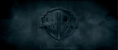
Warner Bros. constitutes another fascinating example of associative logic. For reasons that remain a mystery to me, Warners did away with the traditional WB shield logo in the early 1970s and replaced it with a far more abstract design pictured below. This design reeks of the 1970s — even though it was used well into the 1980s — since I associate it with one of Warner’s premiere franchises: Superman. No matter what film proceeded it, the abstract “W” logo meant Superman: The Movie. For my wife, Monica, the traditional Warners shield is strongly associated with the Harry Potter series. In each film, the shield is desaturated, surrounded by varying cloudscapes, and seems to move past the screen as a 3-D image.
I would be taken to task if I did not mention what is perhaps the most famous associative connection in modern studio logos: the transition from the 20th Century Fox fanfare (composed by Alfred Newman) to the Star Wars main title (composed by John Williams). The two musical statements have worn well together, leading some to think that they were composed together. Newman’s original Fox fanfare premiered in 1935, which was later extended in 1953 to include a logo for Fox’s CinemaScope widescreen process. The extended fanfare appears over the Lucasfilm Ltd. credit.
As a trend in franchise pictures or prestige films, more and more studios are altering their current logo sequence to support particular films. I first noticed minor changes in the 1990s with films like The ‘burbs, The Flintstones (both of which played with the Universal globe), and Gladiator (which simply used a sepia-toned Universal and DreamWorks logo to convey the color scheme of the film). There are many other examples, but some perennial favorites include David Fincher’s use of “vintage” Warners and Paramount logos for Zodiac and, of course, Spielberg’s Paramount dissolves from the Indiana Jones series. The decision to use the Columbia logo from the 1970s for Superbad — complete with a VHS stutter — is an interesting statement, but I was left wondering if the humor was ironic or if the filmmakers had a genuine connection to a particular 70s aesthetic.
As more studios are lending their logos to the narrative/stylistic patterns of particular films, the associational logic of film-to-studio seems appropriate. However, studios have little control over an audience’s association with an untouched logo. Why, for instance, do I consistently think of Friday the 13th and the Star Trek films whenever I see the vintage Paramount logo sequence that dissolves into a sky-blue relief of itself? Some may think of Robert Evans and his tenure at Paramount in the 1970s, but for me it’s the lousy VHS dubs of Star Trek I-IV and even lousier copies of the Friday series.
Then there are those abstract sequences that simply transport me back to my childhood. The Tri-Star sequence (seen here) which has been parodied by Joe Swanson on Family Guy. And the Touchstone logo (seen here) which I never quite got, even though I saw it enough growing up with fare like Who Framed Roger Rabbit?
Studio logo sequences have always fascinated me, but I’ve never been able to explain why. The mini narratives and advancing animation keeps me interested in new concepts and revisions of old formulas, but there is something much more intangible to my interest in pre-credit designs. Perhaps they work on a nostalgic level, as Indiana Jones and the Kingdom of the Crystal Skull demonstrated earlier this summer. Perhaps they are symbols of larger cinematic histories, specifically the history of cinema-going. Or, perhaps they work on a much more associative level, whereby the familiarity of logo sequences are rooted in the experience of a particular film.
Nevertheless, the unspooling of a classic or contemporary pre-credit sequence is an exciting moment, filled with possibility and the knowledge of what has come before.
What are your own memories of studio logo sequences?


I was on Yahoo and found your blog. Read a few of your other posts. Good work. I am looking forward to reading more from you in the future.
Tom Stanley
I’m embarrassed to admit to watching this movie (and by choice too), but I remember Waterworld opening with the Universal globe gradually flooding over until it’s completely immersed in water. I usually don’t pay any attention to logo sequences, but that one was actually pretty cool…wish I could say the same for the movie that followed it.
I am the same with you in terms of the Pavlovian effect certain logo intros convey. For me it was always the slow, piano taps of the United Artists’ logo, which revealed a merged U & A as one, then boomed into a quick orchestral arrangement. Every single time I saw any of the Rocky’s, 1-4, that was the greeting. If I were to hear it now, I’d think someone popped in an old VHS tape of those films. In fact, if you played certain music from those logo intros, I think I’d might be able to pinpoint which studio made it as the music was distinctive enough to isolate “brand” them with both the film and the studio that released the picture.
Also, I do feel that the pre-credit sequences for movies nowadays is getting out of hand with each prodco wanting their name in the billing. There are times when you’re wondering when the film will start or maybe even for the briefest of moments forget the film you are watching.
Asdie from enjoying Zodiac, I did like the touch of using the older logo’s at the beginning.
If you wanna talk about logo overload, some anime films start off with like 28 different logos before the film starts. My most prominent logo memory is 20th Century Fox giving way to John William’s score for Home Alone. I think Williams re-recorded the Fox theme for Star Wars specifically for meshing purposes. I could be wrong though.
Hi, Benjamin. Really interesting post. There’s a tangentially related post over at Bob Rehak’s Graphic Engine on titles that you might be interested in.
I wonder if the phenomenon of the manipulated logo, such as the one from Waterworld cited by a comment above mine, has anything to do with the production studio wanting to assert ownership of the film by seeping into the main film, connecting them iconographically and making the film itself look like the natural offspring of the company.
Thanks for the comments!
Dan: Thanks for the link. I would have to think that studios would be open to manipulating their own logos to tie together their studio with a particular film, especially a tent-pole like Harry Potter or Waterworld. But I’m surprised that we don’t see it more often.
Rick: I actually forgot about the United Artists sequence. Joe Harnell’s rising crescendo is very effective and, like you said, leads into the Rocky fanfare quite well.
[…] logo of Méliès’ company, Star Film. Aspect Ratio has a great article about studio logos here, so it’s worth remembering that branding of films is nothing new. Méliès cements that link […]
[…] – bookmarked by 3 members originally found by shacker on 2008-10-09 Studio Logos by Association https://aspectratio.wordpress.com/2008/09/05/studio-logos-by-association/ – bookmarked by 5 members […]
Bookmarks about Branding said this on October 30, 2008 at 10:00 pm |
The Selznick Studio logo was as classy as the films that Selznick produced. When it hit the screen it always meant that we were in for a special film experience.
[…] the logo of Méliès’ company, Star Film. Aspect Ratio has a great article about studio logos here, and David Bordwell another one here, so it’s worth remembering that the branding of films is […]
Dicks